


Dynamic Slr is the fastest-growing local residential solar company in Texas. They strive to build opportunities one position at a time for those that work with them while saving their customer on their energy bills and leaving a positive impact on the planet.
Project Year: 2023
Client: Malak E.
Company Name: Dynamic Slr
Industry: Solar Company
Project Scopes: Logo Redesign, Logo Animation, Visual Identity, Brand Guideline
Graphic Designer: Ardiann Fauzi
Logo Animation: Taurusa Mahda
Project Outline
The client came with some disappointment from their local branding company they hired before. They mentioned that they received many concepts but none worked unfortunately. The client was expecting the logo to embody a new modern, fresh, young, clean look with a sustainable effect. The client also mentioned that the logo needs to portray the ideas of Solar (Sun), Home, and 3 Elements coming together (representing the 3 companies merging). As they were about to have transformation (3 companies merging), they wanted the logo would be the look of their transformation in serving solar panel for the homeowners in Texas.

Mood Board Creation
Before commencing the project, I crafted a mood board aimed at capturing the essence of the brand. It encompassed images, colors, and logos within the industry that conveyed a modern, youthful, fresh, and sustainable effect, as per the client's expectations. The mood board below reflects the collaborative process that led to a consensus between the client and myself.
It's worth noting that there was a color scheme change midway through logo development, emphasizing that each project follows its unique journey, and there is no fixed path in developing a logo and brand.

Logo Development
The best logo always comes from explorations and playgrounds. Creativity needs to have room for unlimited experiments without any fear of faults. This always happened to all of my projects. That's how I as the designer expand any possibilities that creativity might go. The below explorations only show several sketches and unused vector graphics. The true explorations and playgrounds were dustier and messier. But hopefully, this can get you a picture that a great final logo concept always comes from the ground where the designer is playing around.


Based on the 1st Logo Draft above, the client's feedback was to focus on Concepts 01, 02, and 03 and require several things to be trialed on the 2nd Draft such as:
- incorporating blue and green colors on the logo instead of purples,
- tweaking the mark of Concept 02 to have a wider "sunrays",
- modifying the mark of Concept 03,
- changing the logotype with a typeface that feels curvy and rounded like another solar company logo called "sunrun",
- and experimenting with the logotype to have "slr" only in bold, "dynamic" only in bold, D in capital, and d in all lowercase.

Based on the 2nd Logo Draft above, the client wanted to see Concept 01, 02, and 03 in Dark Green, Green, and Orange Color Palettes. Besides that, she was keen to see:
- Concept 01 with all lowercase and both "slr" only in bold and "dynamic" only in bold,
- Concept 02 with D in capital and "slr" only in bold,
- and Concept 03 with all lowercase but "dynamic" only in bold.
- Concept 01 with all lowercase and both "slr" only in bold and "dynamic" only in bold,
- Concept 02 with D in capital and "slr" only in bold,
- and Concept 03 with all lowercase but "dynamic" only in bold.

Based on the 3rd Logo Draft above, the client agreed to:
- drop the idea of Concept 03 and explore more with both Concept 01 and Concept 02,
- drop the Green color and keep the Dark Green and Orange only,
- and pursue all lowercase logotypes with "slr" only in bold and adjust its boldness.
- drop the idea of Concept 03 and explore more with both Concept 01 and Concept 02,
- drop the Green color and keep the Dark Green and Orange only,
- and pursue all lowercase logotypes with "slr" only in bold and adjust its boldness.
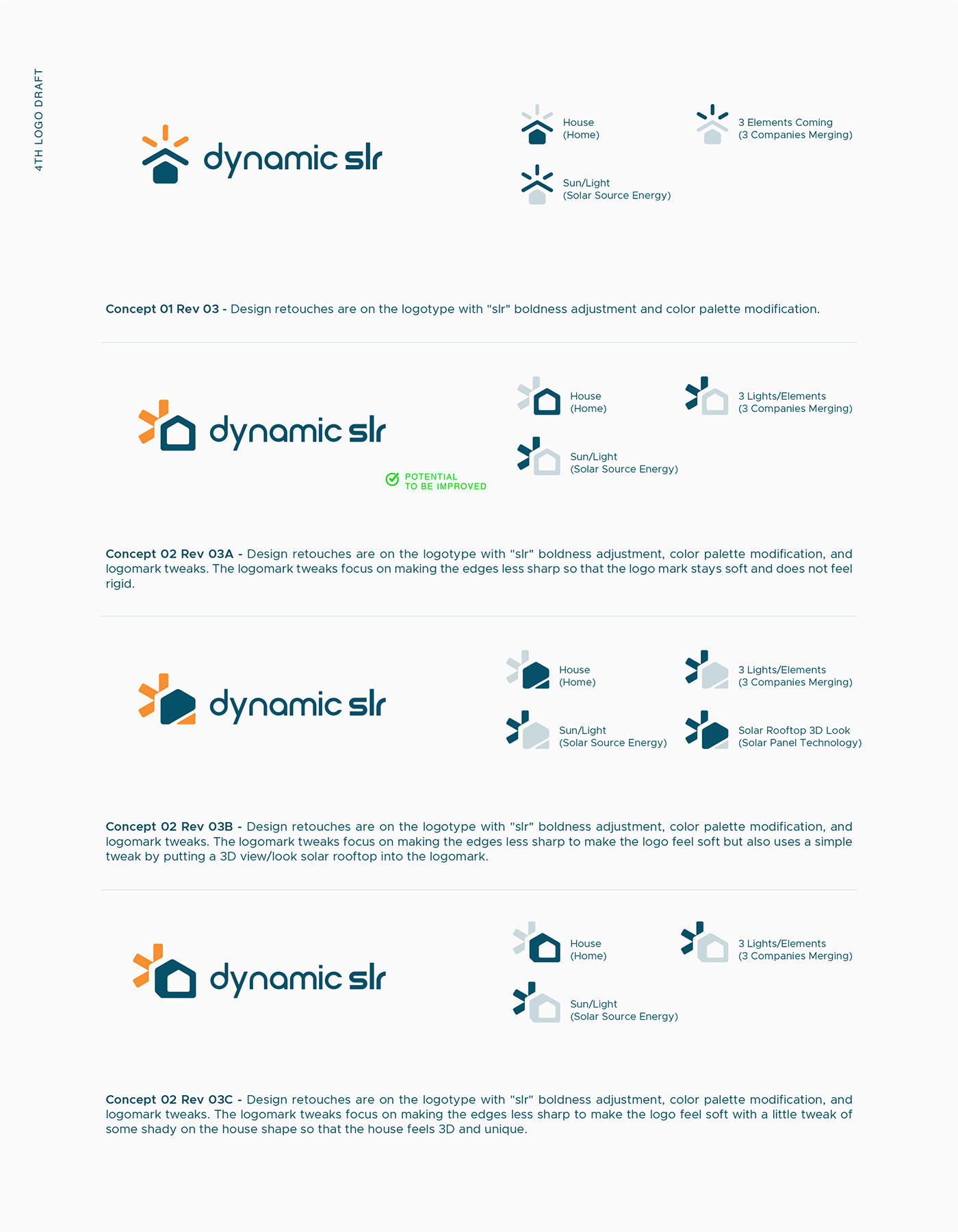
Based on the 4th Logo Draft above, the client agreed to finalize Concept 02 Rev 03A with adjustment on
- the detail size of the logomark (the sunrays and house/home),
- the font used for the logotype,
- no space between "dynamic" and "slr",
- and the arrangement between the logomark and logotype.

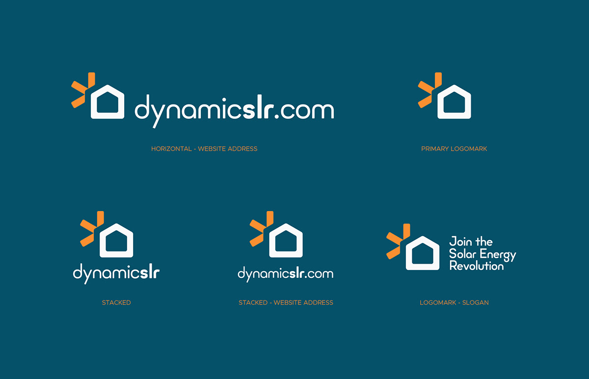
Logo Approved
After having a playful time designing through logo development with constructive feedback from the client, we have finalized the below logo to be the approved logo as the new look of Dynamic Slr.

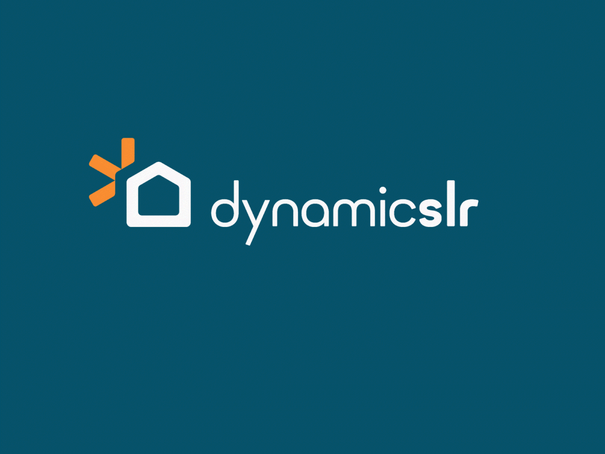
Logo Meaning and Construction
This logomark concept incorporates the shape of a house (home) and the sun/light. However, the sun/light design feels rising from behind the house. The sun/light spark appears in 3 lights/elements representing the 3 companies merging.

The logotype is from Font of Minimo as per the client’s request. The size between the dynamic word and slr word is differentiated with Regular and Bold to emphasize that the brand name is pronounced with two words dynamic and slr. The kern of the font is also adjusted so it can nicely fit the logomark.

Brand Colors
The primary colors of the Dynamic Slr brand are sunburst orange, sunlit white, and solar teal. Those colors are mainly used for the logo and in most cases to represent the Dynamic Slr visual identity. Secondary colors like sunlight, deep teal, and solar silver are sometimes needed. The secondary colors can complement the primary colors, playing backgrounds, shades, themes, and/or brand elements. We also agreed to add some black color to the guide in case of needed to have a black and white theme design.

Typography
The typography of this brand uses three variations of typeface, Minimo, Exo 2, and Metropolis. Below is only an easy-grab guide for using Minimo, Exo 2, and Metropolis for the Dynamic Slr visual identity as every layout might vary and needs its own adjustments.

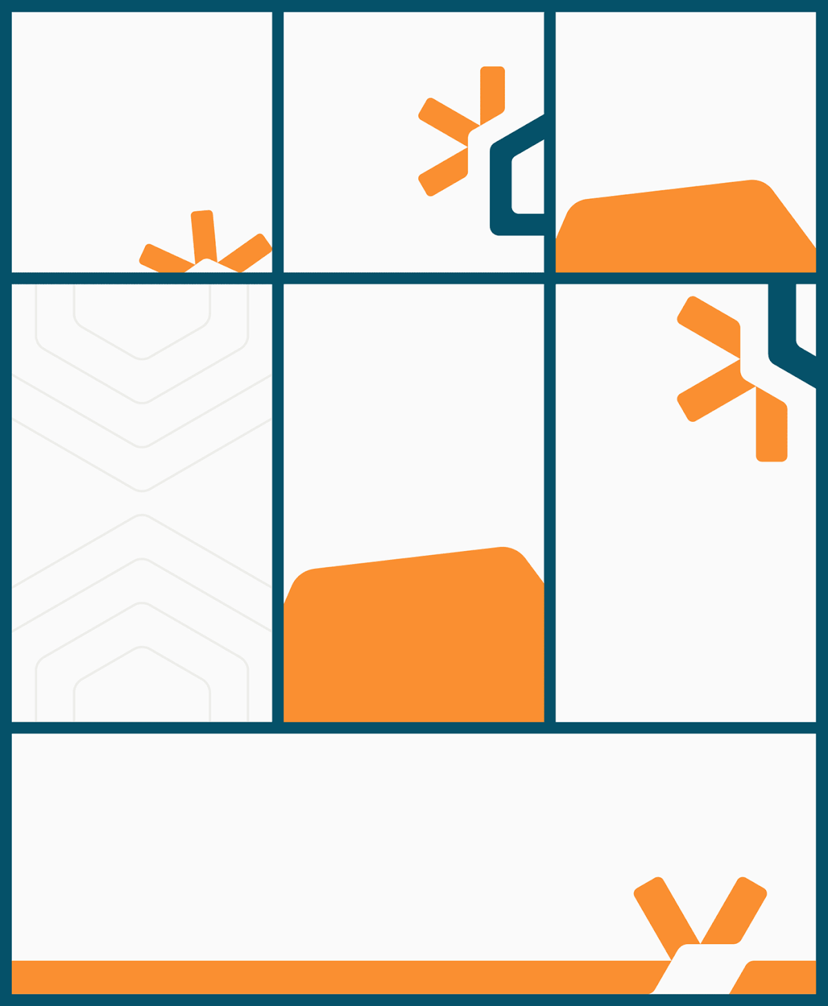
Brand Patterns
The brand patterns are structured by the basic logo shape, which can be created creatively with brand colors and layout play. In this way, the audience will remember the logo shape and colors as the identity of Dynamic Slr. Each shape of the patterns can be described below.

Below are the brand patterns usage examples easily grabbed. Other layouts might need other combinations of play as every layout might vary and need adjustments.
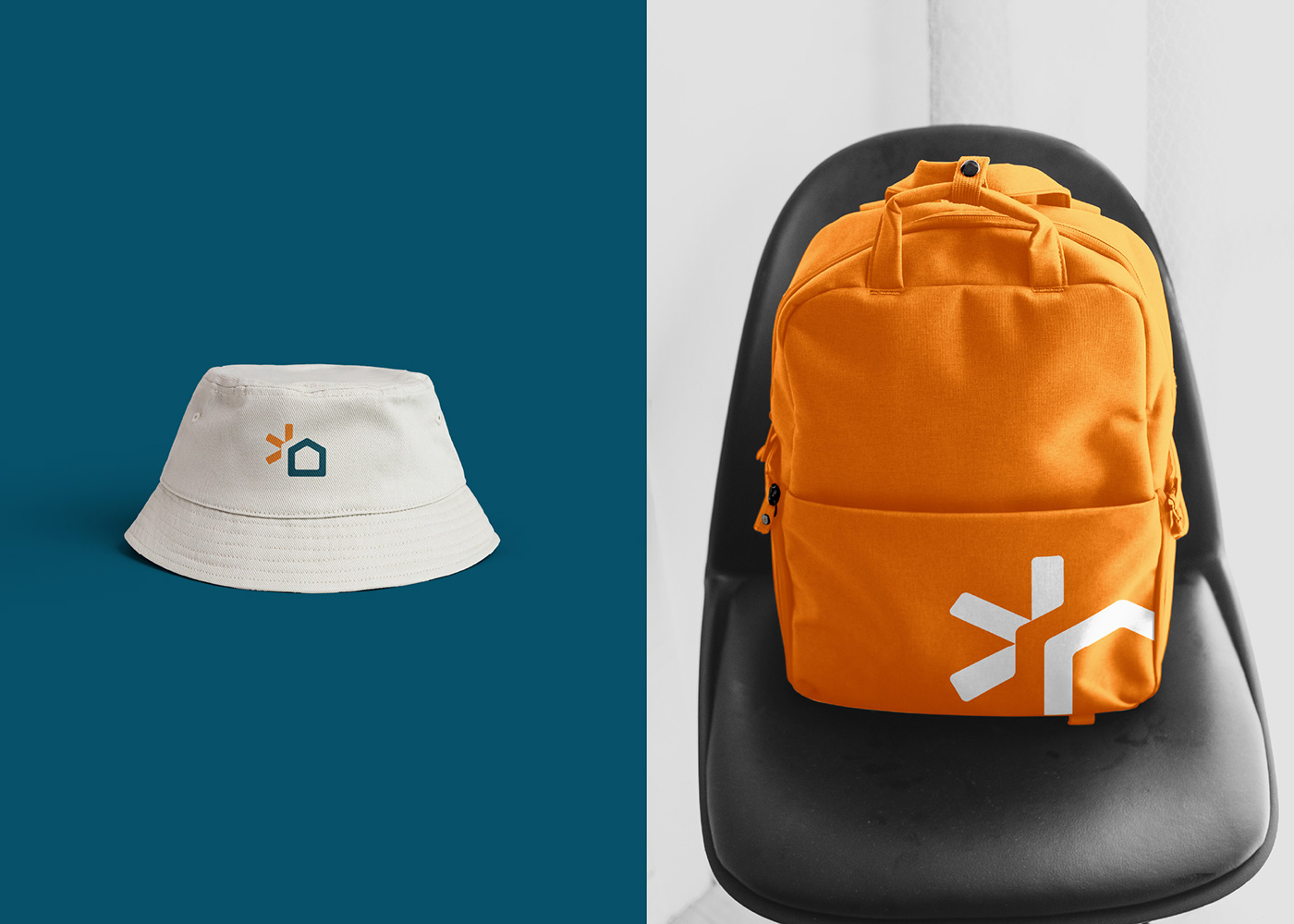
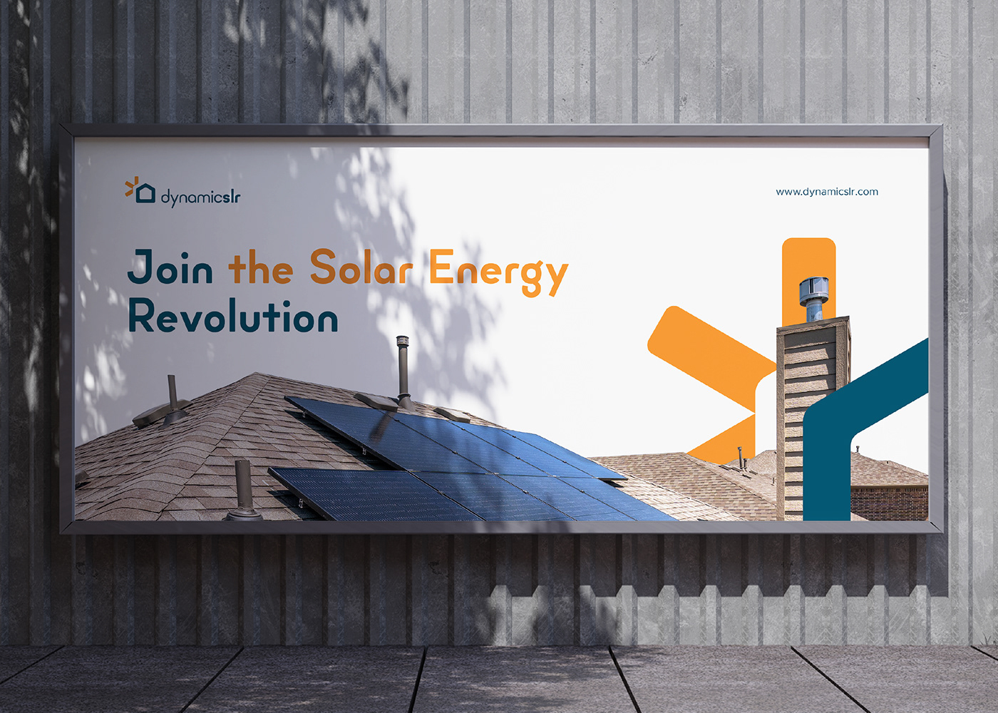
Brand Application
Here below is how the brand logo, colors, typography, and pattern apply to Website Hero, Social Media, Stationery, Apparels, Signage, Posters, and Billboard to create a unity of Visual Identity for Dynamic Slr as a solar technology company.


Thanks for Watching :)
All the works are done by Ardiann except the Logo Animation by Taurusa Mahda.
Ardiann is an independent Logo, Brand Identity, and Graphic Designer living in Yogyakarta, one of Indonesia's Arts and Cultural Cities. He has been in the design industry for 5 years and claims to be a Junior to Mid Graphic Designer. He has worked with worldwide clients, mostly small and medium enterprises and startups.
Graphic design has been his passion since he was in undergraduate school as he used to be involved in student organization activities as the organization event merchandise and poster designer. He has fallen in love with logo and brand design creation since 2017 and tried his best to survive up to now to live with what he loves.
Pictorial, Icon, Monogram, Minimalist, Modern Logos & Brands are the best style you can get from him.
He is always available for freelance work, please drop him an email here at ardiannf.nideli@gmail.com.


